Monday, April 6, 2009

Removing The "Green Eye" Effect From Cat Photos

Okay, so we all know about the "Red Eye" effect from flash photos, right? When a person's pupils are dilated, the flash reflects off their retina and the red glow shoots right back out from their dilated pupils and, well, it can cause some very spooky and demonic looking pictures! Cameras nowadays have special "red eye reduction" flash modes, where the camera does a preliminary flash to make the pupils contract before it does a second flash and makes the shot.

Well similar things happen with cat photos if you use a flash. And I have found it is not always advisable to use the "red eye reduction" flash when taking snapshots of my cats, the reason being that cats don't tend to sit still when you want them to, and by the time your camera takes the snapshot, the cat has changed poses or closed their eyes or moved entirely out of the picture. So I just take my photos and then correct the green eye effect, as discussed here. So, here is a photo of one of my cats, showing a full green eye effect:

(Click the photo to see a larger image)
(Yes I know, the background is not all that great. But we're just doing the eye thing here.)

Even though the pupils are mostly contracted, they still reflected green from the flash and do not look natural. So let's correct this and make the cat look more true to life.

We will start by selecting the pupils. This can be done by using either Select -> Color Range... from the top menu, or if you have a graphics tablet you can make your selection directly with the Lasso tool. You want to leave a bit of the white reflection unselected:
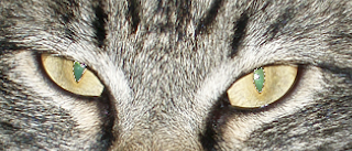

Now the first thing we will do is remove the color by selecting Image -> Adjustments -> Hue and Saturation, and taking the Saturation level all the way down to -100, removing all of the green color:
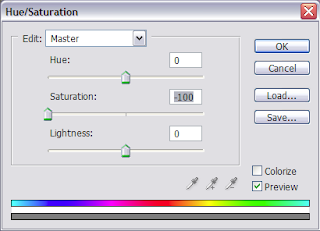

This gets us part way there -- now the pupils are gray, but they still don't look quite right:
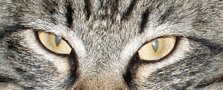

The final step is to darken the pupils, again using Image-> Adjustments -> Hue and Saturation. The tool also has a bar to adjust Lightness, and we adjust it all the way down to -100, making the gray become black:
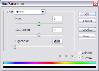

The reason we had to select around the white reflection is that we did not want it to go away when we darkened the pupils -- leaving it there makes the end result look more natural. Here is the end result:
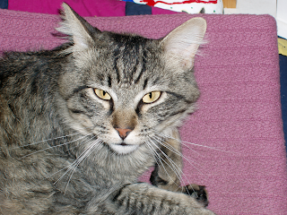
(Click the photo to see a larger image)

You should always keep the Preview box checked so you can see the effects of your adjustments as you make them. Sometimes I have found that I don't want to take the lightness all the way down to -100. It depends on the photo.

Well that's it for today.

Happy Photoshopping!

Wednesday, March 4, 2009

Adjusting a Dark Area With the Curves Tool

What can you do when an important part of your picture is obscured because it is too dark? Photoshop's Curves adjustment is the perfect tool for the job, as I will illustrate here.

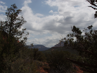
This photo is a good example of the issue and will illustrate the technique:

(click on the photo to see a larger version)

The sky is bright enough, and the clouds have nice detail. But the land and trees are dark and obscured. If you look closely you can see that there are details there, but you can't really make them out.

Let's see how the Curves tool can help. First, open up the Curves dialog box: Image -> Adjustments -> Curves. You will see there is a straight diagonal line. This is the curve we will be adjusting.

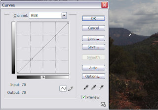
Start by placing the cursor over a part of the picture you want to adjust. Choose a midrange area within the part to be adjusted -- that is, neither the darkest nor the lightest part in the shadows, but somewhere in between. Notice that the cursor looks like an eyedropper. Click the mouse on the part you want to select, and hold the mouse button down to see where this level lands on the curve:


We can see that it is well into the bottom half of the curve. That shows us what part of the curve we will need to adjust.

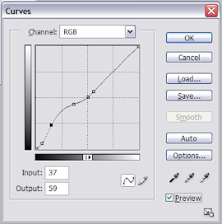
Now we're ready to adjust the curve. First, "pin" the upper part of the curve by making two holding points, at the midpoint and right above the middpoint. Just click the mouse at these two spots. Next, put a holder point down near the bottom of the curve. Now make another point in between the holders, but this time hold the mouse button down and drag the curve upwards to lighten this part of the picture. In this case, I used two points for this, to have finer control. If the Preview box is checked, you can see how your adjustment affects the picture as you are making it.


Once you are happy with the adjustment, click OK. Now admire your handiwork. As you can see, details in the foreground are suddenly much more visible:

(click on the photo to see a larger version)

There was no need to make any tedious selections. All we had to do was find the area of the curve to adjust; that allowed us to make the darker parts of the photo lighter, while leaving the other parts alone.

Happy Photoshopping!

Monday, February 23, 2009

Using Levels to Increase Contrast

I often use the Levels tool adjust the contrast in a photograph. Even a small adjustment can make a big difference. Sometimes that is all a photo needs to make it "pop". Let's take a look at an example:


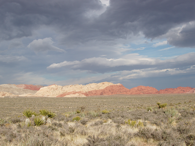
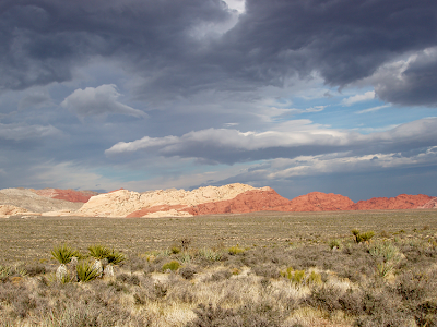
This is a pretty nice photo I took out at Red Rock Canyon. I liked the proportions of the sky to the ground and the calico hills in the distance. But the colors look a little washed out and the effect is kind of "hazy", which was not how I remembered it looking.

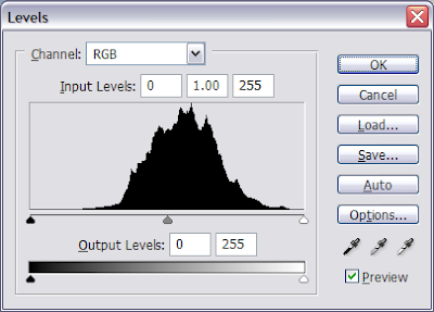
So I thought I'd see what I could do to improve it with Levels. I selected Image -> Adjustment -> Levels:
This histogram looks somewhat like a Bell curve, with the ends tapering off and becoming level at the ends. So it's a good candidate for creating contrast with this tool, because you can "lop off" the flat ends without losing detail.

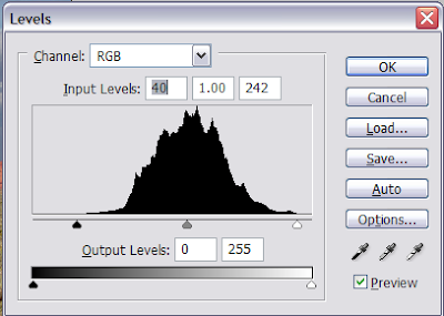
The idea is to pull in the sliders along the flat parts of the curve. Below are the settings that I chose. Note the Preview box is checked, allowing me to see the changes to the image as I moved the sliders. This helps to eliminate the guesswork:
Note the values in the Input Levels boxes: 40 (an increase of 40 from the initial value of 0) on the left and 242 (a decrease of 13 from the initial value of 255) on the right. Sometimes you might want to adjust the center slider a little, to bring the overall picture a little bit lighter or darker, but that was not necessary here. So here is the result:As you can see, this very simple adjustment created a more dramatic image. Although I usually try to avoid large adjustments -- 40 is a lot! -- in this case, I thought it worked out very well.

The main thing to remember is that this method for increasing contrast works best when you have flat "tails" at the end of the histogram. If you are lopping off parts that aren't flat, then you are also losing details.

Happy Photoshopping!

Saturday, February 21, 2009

Using the Measure Tool to Level a Photo

Welcome to my Photoshop Tips blog! I use Photoshop's photo editing and artistic enhancement techniques on a daily basis in my business. My intention is to help others master simple techniques for enhancing their own photos, as well as for producing art work based on photos.

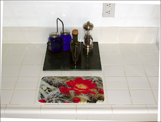
Today's tip is how to use the Measure Tool to straighten a picture.

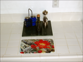
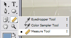
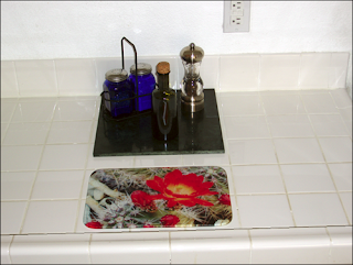
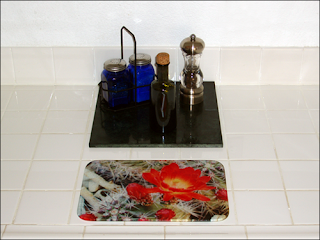
Here's the original photo we want to level:The Measure Tool will let us take the guesswork out of rotating this photo to level the edge of the counter. The Measure Tool looks like a little ruler:
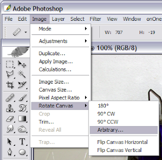
With the Measure Tool selected, hold down the mouse button and draw a bead from the left side to the right side that is parallel with the counter edge, releasing the mouse button when you reach the end (in this case the tile grout provides a ready-made line to follow). If you can't see where the line is please click on the photo to bring up a larger image:Now select Image -> Rotate -> Arbitrary:
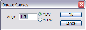
You will see when the Rotate window pops up that it has calculated the exact degree of rotation needed to level the image. Double check that the correct direction is selected -- Clockwise (CW) or Counterclockwise (CCW) -- before pressing OK:After the rotate, the picture looks like this:The canvas has been enlarged and filled in with the background color (in this case white) behind the rotated picture. Now use the rectangular Marquee to select the part you want, crop the image and make any final edits to arrive at the finished and leveled photo:Well there's today's tip, Enjoy!